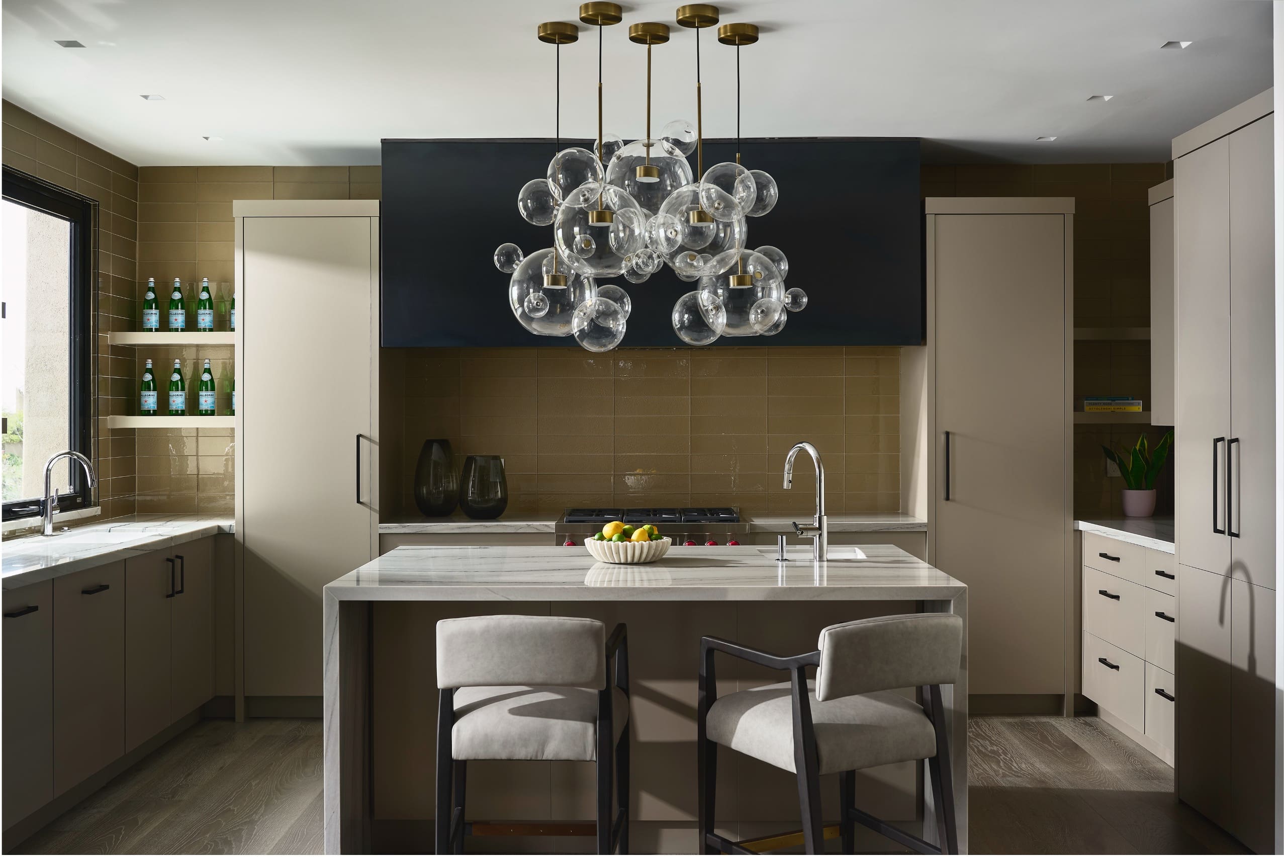
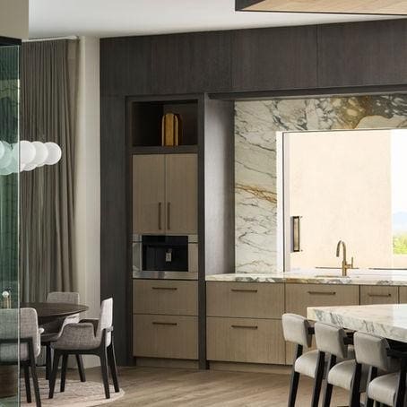
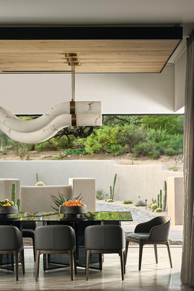
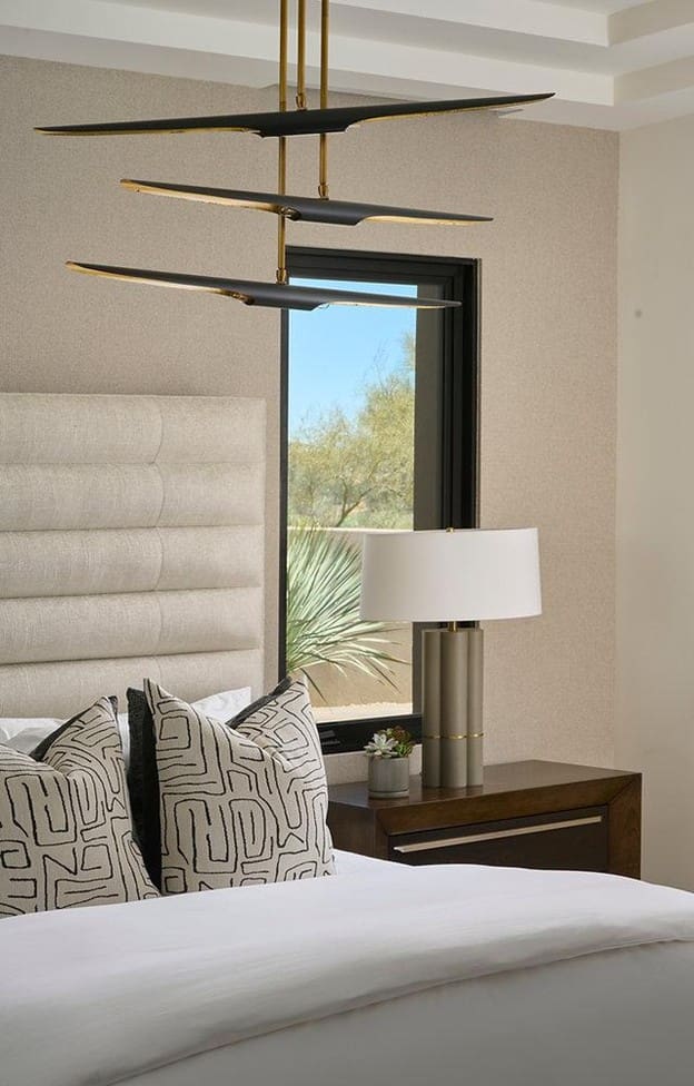
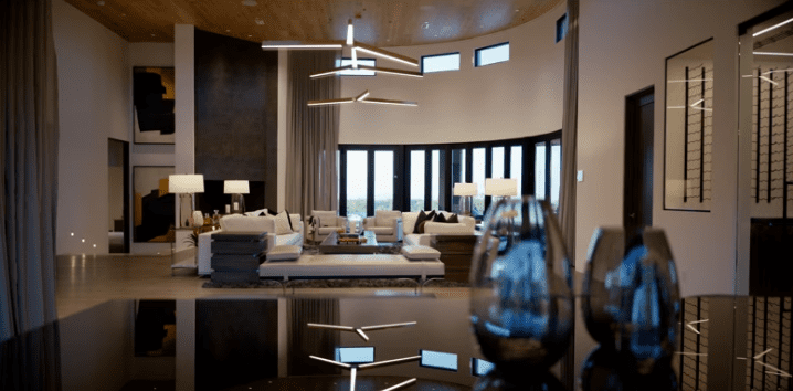
Most designers will tell you that a mood board makes or breaks a project before a single piece of furniture is purchased. Yet surprisingly few clients, and even some aspiring designers, understand what actually goes into one beyond a collection of pretty images pinned together. The result is a tool that looks decorative but fails to function as the strategic foundation it was meant to be.
A professional interior design mood board is far more than an aesthetic collage. It is a precise communication document that aligns vision, material choices, color relationships, and spatial feeling into one cohesive reference. When built correctly, it guides every decision from furniture sourcing to lighting selection, keeping the entire project anchored to its original intent.
In this tutorial, you will learn exactly what experienced designers include in a mood board, why each element earns its place, and how the composition of these elements works together to tell a complete design story. Whether you are refining your own process or building your first professional-grade board, this breakdown will give you a clear and actionable framework to work from.
The distinction between a consumer Pinterest board and a professional interior design mood board is not a matter of aesthetics or effort; it is a matter of structural discipline. A Pinterest board accumulates imagery with no obligation to material reality, spatial scale, procurement availability, or project budget. Images are saved because they resonate visually, not because the stone finish shown is available from a vendor with acceptable lead times, or because the ceiling height in the photograph is remotely consistent with the room being designed. That absence of constraint is precisely what makes Pinterest useful for casual inspiration and professionally insufficient for a resolved design direction.
A professional interior design mood board is built under an entirely different operating framework. Every element included is evaluated against the specific conditions of the project: the square footage, the architectural language of the structure, the way the client actually lives in the space, and what can be realistically sourced, fabricated, and installed within the project timeline. What gets edited out is just as deliberate as what gets included. A board that cannot hold those constraints is not a design tool; it is a reference library.
The platforms themselves reflect this divide. Professional designers working at the specification level use tools such as Morpholio Board or Studio Designer, which connect visual compositions directly to product data, pricing tiers, and vendor sourcing. Consumer platforms carry none of that specification infrastructure. For an affluent homeowner investing in a custom build or comprehensive remodel, working from a loosely assembled inspiration folder creates real downstream risk. Inconsistencies that seem minor at the concept stage tend to compound once construction begins, producing costly change orders, misaligned material selections, and design decisions that lack a coherent throughline. The professional mood board exists precisely to prevent that outcome.
A professional interior design mood board operates as a precision instrument, not a collection of aspirational imagery. Each element placed on the board carries specific communicative intent, and understanding what that content actually represents separates a working design document from a decorative reference sheet.
Finish and material direction begins with specificity. Referencing “natural stone” communicates nothing useful to a builder or fabricator. The distinction between honed travertine and book-matched quartzite is a decision about texture, veining scale, surface absorption, and maintenance behavior, each material claiming a different position within the room’s material hierarchy. Similarly, tadelakt plaster and smooth integral plaster read entirely differently under raking light; one carries handmade depth, the other resolves into an architectural plane. Wire-brushed white oak and rift-cut walnut are not interchangeable warm woods; they establish different registers of formality and craft. A resolved mood board identifies which material does which work.
Color temperature and spatial tone address how a room behaves over time, not just how it photographs. A professional board communicates the interplay between warm ambient sources and cool stone surfaces, the way aged brass hardware pulls yellow tones from a pale plaster ceiling, and how a space reads differently at early morning versus evening. This is the difference between specifying a paint color and designing a room. Publications like Interior Design Magazine regularly document how designers resolve this layered light logic at the concept stage, before finish selections are locked.
Furniture silhouette and scale language establish a spatial grammar. Whether a room reads as low-slung and horizontal, vertically scaled, or architecturally rectilinear determines the proportions of custom millwork profiles, the depth of upholstered seating, and the visual weight of case goods. These decisions need to exist on the board before a single specification is written, because they govern downstream execution across multiple trades.
Lighting direction on a professional board addresses fixture typology (recessed linear, pendant-integrated, wall-mounted), color rendering index targets for finishes to read as intended, and the layering logic between ambient, task, and accent sources. These are not decorative afterthoughts; they become structural line items in a coordinated lighting plan.
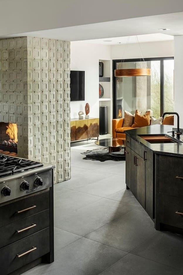
Texture relationships define the tactile logic of a room. Matte surfaces against sheen, raw stone against polished metal: the distribution of these contrasts across a space is mapped at the concept stage so that specification decisions remain coherent throughout the project.
For projects in Scottsdale and Paradise Valley, the board must also resolve indoor-outdoor material continuity. Stone flooring that transitions through a glass wall to a pool deck, or interior plaster that echoes the stucco massing of the architecture, cannot be reconciled during construction without significant cost and coordination risk. These relationships belong in the concept document, resolved before the first specification is issued.
The mood board does not arrive at the beginning of a project, nor does it emerge in parallel with drawing sets or finish schedules. Its position in the sequence is specific and intentional. It is generated after the discovery and programming phase, once the designer has developed a clear understanding of how the client lives day to day, how they entertain, what spatial experiences resonate with them, and what functional demands the project must accommodate. Only after that foundation has been established does the mood board take shape. It has no business existing before that listening has occurred.
This sequencing matters because the mood board functions as the first binding design decision of the project. Every specification that follows, including finish schedules, furniture selections, millwork drawings, and lighting plans, must remain accountable to the direction it establishes. When the board is developed with sufficient resolution, it creates a throughline that runs from the initial concept all the way through construction administration. When it is underdeveloped or skipped entirely, that throughline does not exist, and each subsequent decision is made in relative isolation.
In a documentation-driven process, the mood board is not a standalone aesthetic exercise. It is the visual anchor of a developing specification narrative. Its clarity directly determines how effectively the design intent can be communicated to the project’s full team: architects, general contractors, millwork fabricators, lighting designers, and trades. A resolved concept board gives every collaborator a shared point of reference before a single drawing is issued.
At JSF Design, concept development serves precisely this function. The work done during client discovery is translated into a documented visual and material direction that can be reviewed, approved, and built upon through every subsequent phase. This is not a stage that gets revisited once construction is underway. Projects that compress or bypass this work tend to produce the most consequential and costly misalignments: a stone finish selected without reference to the architectural material palette, a furniture plan that was never tested against actual ceiling height, or a lighting scheme that was value-engineered after the fact without any understanding of the spatial intent it was originally designed to serve.
The value of a resolved interior design mood board is most clearly understood not at the concept stage, but at every phase that follows it. When a client approves a material direction and spatial tone before specification work begins, that approval becomes a functional document. Subsequent decisions about stone selection, millwork profiles, lighting systems, and textile layers can be made by referencing an agreed framework rather than reopening foundational questions at each presentation. This compression of decision cycles is not incidental; it directly reduces scope changes and the project hours consumed by recovering from them.
The benefits extend well beyond the designer-client relationship. A resolved mood board gives the full project team, including the architect, general contractor, and key trades, a shared visual reference point from the earliest stages. This shared reference reduces the ambiguity that generates unnecessary RFIs, substitution requests, and field decisions that drift from design intent. When a tile subcontractor or millwork fabricator understands the intended finish quality and material register before bidding, their pricing reflects that scope accurately. Fewer questions arise during construction, and those that do are easier to resolve against an established standard.
Specification development is also faster when the foundational decisions have already been made. Once material hierarchy and spatial tone are established at the concept stage, the path from mood board to finish schedule is largely direct. The designer is not resolving primary questions mid-specification, which compresses timelines and reduces rework across the drawing set.
The underlying principle, well-documented in construction cost literature, is that design changes become exponentially more expensive as a project advances. A revision at the concept stage costs time on paper; the same revision during construction can trigger labor, material, and schedule impacts that multiply the original cost several times over. The mood board, properly resolved, is an investment in precision. The hours spent establishing design direction before a single specification is written are recovered many times over during the phases where execution is the only work left to do. For a detailed look at how structured design processes support this kind of project-phase clarity, the principle holds consistently across residential scales and project types.
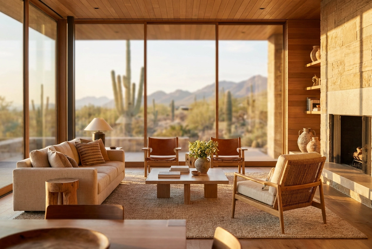
Designing a mood board for a Scottsdale or Paradise Valley residence requires a level of climate and site literacy that no generic luxury template can substitute. The light in this market is a design material in its own right: intense, directional, and present for roughly 300 days a year. A stone sample that reads as a warm, creamy neutral under the diffuse northern light of a Manhattan showroom will often appear stark or bleached when installed beneath full Arizona sun. Blue-hour light in the Sonoran Desert carries a distinctly violet cast, produced by the atmosphere’s low particulate content, which means warm metals — unlacquered brass, aged bronze, hand-forged iron — shift in quality from midday to evening in ways that must be anticipated at the mood board stage. A board built for this environment explicitly represents how materials will perform across the full arc of a desert day, not just under controlled interior conditions.
The regional material palette is not a stylistic choice; it is a response to geology, climate, and a centuries-long building tradition. Honed limestone and chiseled-edge travertine are geologically continuous with the site in ways that require no justification to a client who looks out at the McDowell Mountains. Unlacquered brass and aged iron develop their patina more slowly in the low humidity of the desert Southwest, meaning the material ages with more control and less unpredictability than it would in a coastal environment. Exterior-grade lime plaster connects the interior surface language directly to the architectural envelope — a continuity that painted drywall physically cannot achieve. These are not aesthetic preferences; they are materially informed decisions that a resolved mood board communicates with precision.
Indoor-outdoor integration in this market is an architectural condition, not a lifestyle amenity. Great rooms open directly to covered loggias, primary suites extend into private courtyards, and fully equipped outdoor kitchens operate as legitimate extensions of interior kitchen programming. The mood board must carry a coherent finish and material language across that threshold without interruption. Weathered white oak, brushed concrete, hand-applied plaster, and aged linen perform both technically and aesthetically in this climate: they absorb and modulate directional light, they hold their character through monsoon humidity swings, and they do not require the level of maintenance that more delicate surface treatments demand.
A mood board built specifically for a Desert Mountain or Paradise Valley project reflects genuine regional fluency — not a token reference to the landscape, but a working knowledge of how clients in this market live, entertain, and occupy space across a full calendar year.
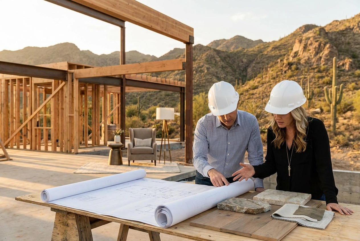
Physical material presentation is not a stylistic preference at the specification stage; it is a professional requirement. A stone sample in hand communicates weight, veining depth, surface variation, and actual color temperature under specific light conditions in ways that no screen rendering can replicate. For high-investment decisions such as full-height stone cladding, book-matched slabs, or large-format porcelain tile across an open floor plane, approving material from a photograph introduces real execution risk. The physical review session, where samples are evaluated under the project’s natural light conditions and held against adjacent finish selections, is where consequential material decisions are made with confidence.
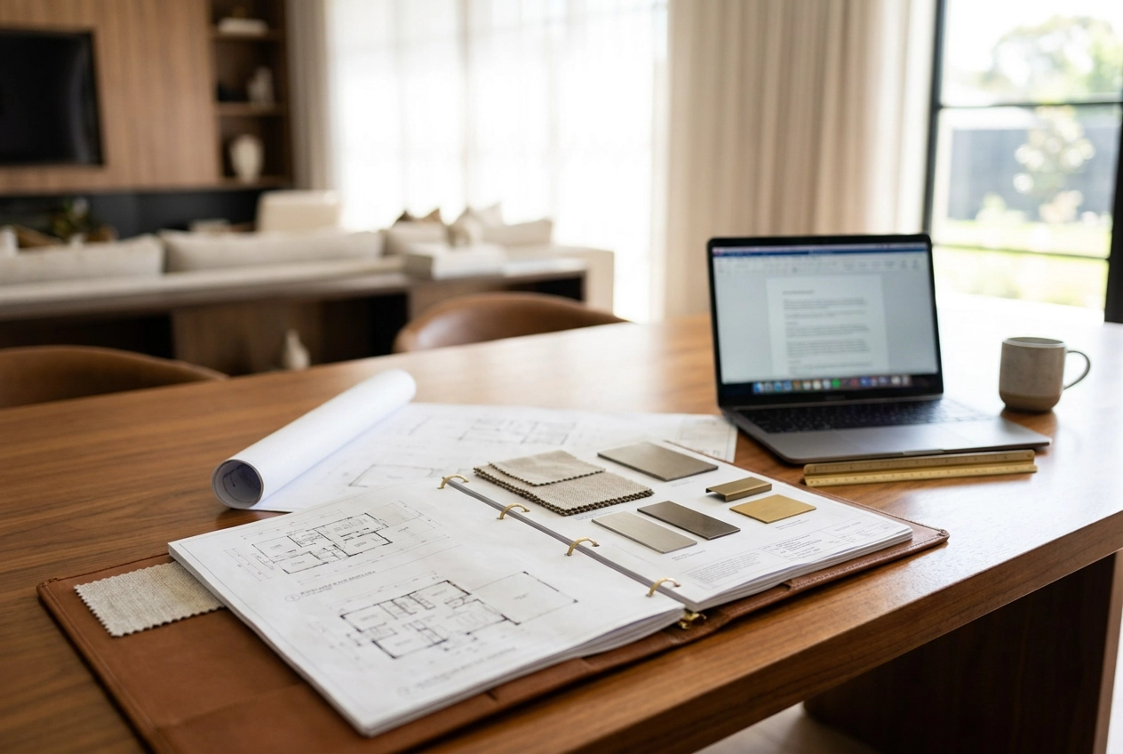
Digital boards serve a different and equally important function. Platforms like Morpholio Board and Studio Designer allow designers to build presentations where each element is linked to live product data: vendor sourcing, specification codes, pricing tiers, lead times, and trade notes. The board becomes a working procurement document, not merely a client-facing visual. When that level of embedded information is built correctly, the design team can move from presentation approval directly into the ordering and specification phase without rebuilding documentation from scratch. That efficiency has real value on projects with compressed timelines or multiple simultaneous trade packages.
In practice, designers working at the luxury residential level operate with a hybrid structure. Digital boards handle client-facing concept presentations, internal design development, and remote review sessions. Physical sample sets are reserved for the material review stage, where tactile quality and actual color rendering under natural desert light require direct evaluation. These are not competing formats; they serve sequential purposes within a single, disciplined process.
The structure and annotation of a digital board communicates professional rigor before a single word is spoken. Organized material groupings, labeled with finish names, manufacturer references, and room assignments, signal to the client that the process behind the presentation is as resolved as the concept itself. That organizational clarity is a marker of how the rest of the project will be managed.
Format, however, does not substitute for conceptual discipline. A beautifully assembled physical sample board built around an unresolved design direction delivers no more decision-making clarity than a loosely curated digital file. The format is the vehicle; the resolved concept is what carries the project forward.
The interior design mood board is not the starting point of a project; it is the first resolved output of a process that begins well before any imagery is assembled. Discovery informs the brief, the brief defines the material and spatial parameters, and the board gives those parameters visual form. Every specification decision that follows, from stone selection to millwork profiles to lighting layering, traces back to what was established and approved at the concept stage. Without that anchor, downstream decisions become reactive rather than intentional.
In markets like Paradise Valley and Desert Mountain, where custom homes regularly involve significant material investment, extended construction timelines, and coordination across multiple trades, an unresolved concept direction carries real risk. Change orders are costly. Material lead times are long. A resolved mood board eliminates ambiguity before it reaches the field.
At JSF Design, concept development is treated as the foundation of a fully documented design stack. The board is not a standalone deliverable; it is the reference point from which specification books, construction drawings, and trade communication are built. That structured approach ensures the design vision is executed with precision, not approximated.
If you are planning a new build, remodel, or high-end renovation in the Scottsdale area, connect with JSF Design to learn how the firm’s concept development and documentation-driven process translates a clear design direction into a fully coordinated, construction-ready project.
A professional mood board is not decoration; it is direction. When built with intention, it aligns your vision, anchors material choices, and keeps every decision connected to the original creative brief. The difference between a board that inspires and one that actually guides a project comes down to what you include and why each element earns its place.
The key takeaways are simple: mood boards require purposeful curation, not just beautiful imagery. Color relationships, texture samples, spatial references, and tonal consistency all work together to tell a complete design story. Leave any of these out, and the foundation weakens.
Now it is your turn. Start building your next mood board with this framework in hand, and watch how quickly your design decisions become clearer, faster, and far more confident. The right foundation changes everything.
BEST THE EDIT
of
Material Moves: Inside Jeffrey Florentine’s Collaboration With Antolini Stone Some collaborations happen because of timing. Others happen because of shared philosophy. The partnership between Jeffrey Florentine of JSF Design and Antolini Stone feels very much like the latter — a collaboration rooted in a mutual belief that materials should shape architecture, not simply finish it. […]
Elevate Your Space
Design Goes Beyond Aesthetics...
It Shapes Experience.
+ Show / Hide Comments
Share to: