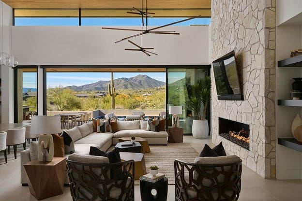
The desert Southwest has a way of demanding interiors that rise to meet its drama. In Scottsdale and Paradise Valley, where architectural pedigree runs deep and the landscape itself becomes part of the design conversation, a generic approach simply will not do. Your living room needs to work harder, look smarter, and feel more intentional than anywhere else.
Whether you are refreshing a mid-century modern gem in Old Town or reimagining a sprawling Paradise Valley estate, the right living room design ideas can transform a functional space into a genuine reflection of the region’s sophistication. This list cuts through the noise and gets directly to what works in high-desert homes, from material choices that honor the environment to furniture arrangements that maximize those coveted mountain and city views.
Expect actionable guidance grounded in the specific demands of Sonoran Desert living: intense natural light, indoor-outdoor connectivity, and a design culture that values both warmth and restraint. These are not generic tips; they are strategies tailored to one of the most discerning residential markets in the American Southwest.
The most consequential living room design decisions are made long before a furniture plan is drawn. Ceiling articulation, millwork placement, and window positioning establish the spatial logic the room will follow for the life of the home. These are not stylistic preferences that can be revisited later; they are structural commitments that define proportion, light quality, and how the space feels from every entry point. When these decisions are deferred or treated as secondary to finish selection, the result is a room that requires constant compensation rather than one that performs naturally.
Living room design in a custom home is fundamentally a systems problem. How light enters at different hours, how the great room connects to the kitchen, the loggia, and the primary corridor, and how architectural volume is expressed across a large open plan all precede material selection. In Desert Mountain and Paradise Valley homes, where great rooms frequently reach 20 to 24 feet at the ridge, ceiling design is not optional. Beams, coffered planes, or strategically dropped soffits introduce horizontal reference points that bring scale down to a human level, adding warmth to volumes that would otherwise feel unanchored regardless of furnishings.
Space planning at the architectural phase must account for furniture zones, traffic circulation, and focal points simultaneously. Early design involvement at the planning stage prevents the costly late-stage changes that occur when outlet placement, ceiling height transitions, and window alignment are resolved without a furniture plan in mind. Retrofitting furniture into an architecturally unplanned room rarely produces a resolved result; the proportions simply do not support it.
JSF Design engages at the space planning and specification stage, well before procurement begins. This architecture-first process, combined with bespoke detailing developed from specific project conditions, ensures that every millwork profile, ceiling condition, and furniture zone is resolved as part of a single coherent system rather than assembled after the fact.
Matching all wood tones throughout a living room — flooring, millwork, and case goods locked to the same species and stain — produces a visually flat result. Without tonal variation, the eye has no hierarchy to follow, no material contrast to register, and the space reads as uniform rather than layered. Depth in an interior comes from differentiation, and wood is one of the most effective tools for achieving it.
The current standard in high-end residential work pairs white oak flooring with walnut cabinetry or case goods, then introduces a lighter species — ash or quarter-sawn pine — in accent furniture. This three-tier tonal range creates a coherent palette with genuine visual movement. The white oak anchors the floor plane with its pale, linear grain; walnut brings weight and richness to the vertical surfaces; the lighter accent pieces lift the composition without breaking its warmth. As Woodgrain’s guide to mixing wood finishes notes, light, medium, and dark woods coexist successfully when their undertones complement one another and each finish has sufficient presence to read on its own.
The operative principle is contrast control. Species should vary in tone and grain character, but the overall value range must stay within a warm, complementary family. Introducing a cool-stained or gray-toned wood alongside warm walnut and white oak creates an undertone collision that reads as unresolved rather than intentional. For further guidance on managing this balance in practice, Emily Henderson’s breakdown of mixing wood tones provides a useful reference point on identifying undertone registers before committing to a palette.
At the specification level, mixed wood tones require explicit documentation. Finish samples, veneer cuts, and grain direction must be called out in writing so that the flooring contractor, millworker, and furniture vendor are all working from the same physical reference. Without that documentation, each trade defaults to its own interpretation, and the result is a palette that drifts. In Scottsdale and Paradise Valley homes, where natural light is intense and shifts dramatically across the day and seasons, wood tones can read several values lighter or warmer depending on orientation and time of day. Finalizing selections requires full-day light sampling within the actual space, not a showroom review under controlled lighting.
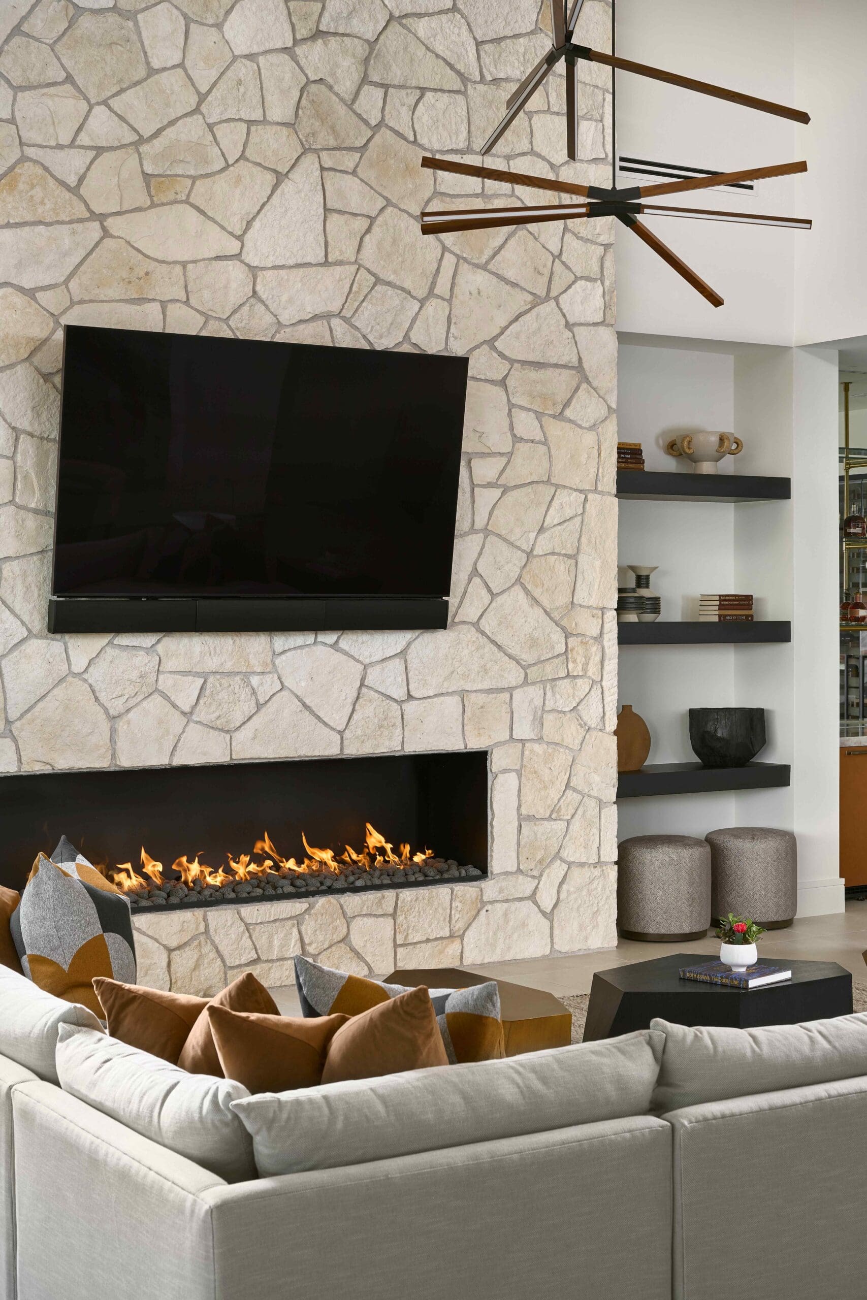
Fluted and reeded millwork profiles have earned their position in serious residential design through sustained relevance, not cyclical momentum. The appeal is architectural: parallel grooves cut or routed into a surface create shadow lines that shift with the light, adding depth and dimensionality to what would otherwise be a flat plane. This is texture with intent, not applied decoration. In a well-resolved living room, fluted millwork reads as a material commitment, one that signals craft and considered detailing throughout the space.
Scale is where many otherwise well-conceived projects lose their footing. A fluted fireplace surround in a room with 12-foot ceilings demands wider flute widths, deeper relief, and more generous spacing to hold visual weight at that volume. The same profile dimensions applied to a lower built-in or a base-height accent panel will appear overscaled and restless. The rule is proportional: flute width and depth should relate to the field size of the panel or surface they occupy, and spacing intervals should allow each groove to read distinctly rather than compress into surface noise.
Application surfaces in the living room extend well beyond the fireplace surround. Entertainment millwork, accent walls, column wraps, and even scaled-up casing and base profiles are all candidates for fluted detailing, though each surface presents different constraints around depth, spacing, and fabrication approach. A column wrap may require stave construction to accommodate the profile around a structural element. An entertainment wall running full height may call for a shallower flute to preserve the visual coherence of integrated cabinetry.
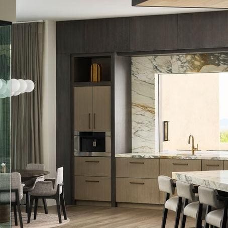
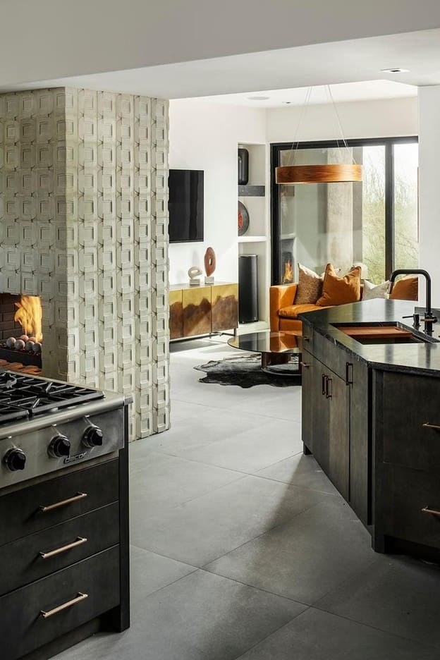
Finish selection fundamentally changes the visual behavior of the profile. In painted MDF, fluting becomes an exercise in geometry and shadow line: the grooves read as crisp, high-contrast marks, particularly in rooms with directional or raking light. In wood veneer, the fluting reads as material richness first, with the shadow lines serving a secondary role. The choice should follow the room’s overall material palette and weight. A living room anchored in natural stone, warm-toned woods, and soft plaster benefits from veneer fluting. A cleaner, more architecturally spare room may call for the precise geometry of a painted profile, as seen in fluted luxury stone fireplace surround applications where the emphasis is entirely on form and shadow.
Execution requires documented coordination across trades. Fluted profiles must be drawn with exact dimensions in millwork shop drawings: flute width, depth, spacing interval, and transition details at corners, returns, and terminations. Without this level of documentation, inconsistencies emerge when a finish carpenter interprets dimensions loosely across a full room of custom work. The coordination between the designer, millwork fabricator, and contractor is the difference between a detail that reads as intentional architecture and one that reads as approximate.
Pantone’s selection of Cloud Dancer as the 2026 Color of the Year marks a historically significant moment; it is the first time a white has held that designation. The signal is precise: white remains foundational in high-end residential interiors, but the directive has shifted away from the cool, clinical whites that characterized the previous decade toward softer, warmer expressions with balanced undertones. In the context of [desert contemporary architecture across Scottsdale and Paradise Valley](https://jsfdesigninc.com/desert-home-interiors/), this shift is less a trend than a correction toward materials that already belong to the landscape.
The more consequential design decision, however, is not which warm neutral anchors a living room. It is how finish contrasts are layered within that neutral field. A room built entirely in Cloud Dancer tones will read as flat without friction between surfaces: polished stone positioned against a honed field, lacquered millwork set against raw plaster, smooth upholstery adjacent to a nubby looped textile. The visual interest lives in that friction, not in the neutrals themselves.
Polished surfaces are returning in 2026 as a deliberate counterpoint to several years of uniformly matte interiors. The matte-everything approach produced spaces that, while calm, often lacked material depth. Introducing a polished limestone insert beside a honed surround, or a gloss-lacquered cabinet face set against a sand-toned plaster wall, restores that depth without introducing color complexity.
In desert contemporary architecture, the material argument is also environmental. Creamy limestones, sand-toned plasters, and warm white oak are not neutral choices imposed on the landscape; they are drawn from it. These materials perform differently in high-UV desert light than they do in northern or coastal environments, which reinforces a critical process requirement: finish contrast must be evaluated on a physical sample board, reviewed under the actual light conditions of the space. What reads as sufficient contrast under showroom lighting can collapse entirely, or become unexpectedly stark, in a south-facing Scottsdale great room with afternoon sun at full intensity.
In Scottsdale and Paradise Valley, the indoor-outdoor connection is not a design feature to be layered in at the finish stage. It is a structural commitment that shapes the living room from the earliest planning conversations. Luxury buyers in these markets specifically seek homes where interior and exterior spaces read as a continuous, intentional environment, and that expectation must be addressed in schematic design, not resolved during construction documents.
The great room is typically the primary hinge point in this relationship. Glazing selection, multi-panel door systems, and the continuation of interior floor materials to the exterior are interdependent decisions. Specifying them separately, on different timelines or by different parties, routinely produces misaligned thresholds, inconsistent reveals, and floor level transitions that undercut the spatial integrity of the room. Resolving these systems together, with coordinated drawings across design and architecture, is what produces a threshold that disappears rather than interrupts.
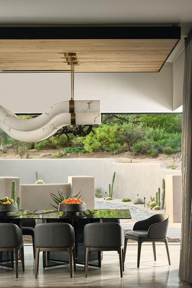
Material continuity is one of the most technically effective tools for extending perceived square footage. Carrying large-format quartzite or limestone from the interior floor plane through a covered loggia eliminates the visual boundary at the glass line. The eye reads a single surface rather than two adjacent spaces, and the room expands accordingly.
Solar exposure in a western-facing great room is a specification constraint, not an aesthetic variable. Furniture positioned in direct afternoon sun in the Phoenix climate requires solution-dyed performance textiles and UV-rated materials as baseline selections. No fabric preference overrides sustained solar exposure at this intensity.
Lighting design must address interior and exterior sources simultaneously. The dusk transition is the most demanding moment: as ambient light drops outside, interior and exterior dimming levels and color temperatures need to track together across the glass. A warm interior paired with an uncontrolled, uncoordinated exterior reads as two disconnected environments. Coordinating these systems at the design stage, rather than patching them at installation, is the standard that high-end projects in this market require.
The single-finish approach to metal in a living room has largely given way to a more deliberate framework, one that treats each finish as a material with a specific spatial assignment rather than a default selection. This reflects a broader maturation in high-end residential design: complex, layered rooms resist universal answers, and a thoughtful finish hierarchy reads more resolved than uniformity ever could.
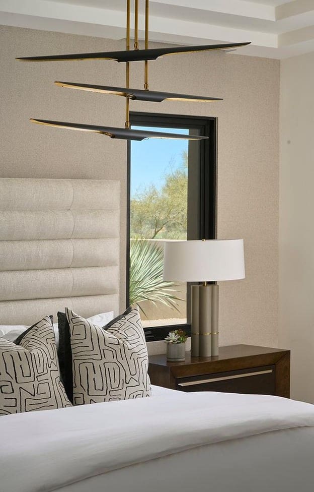
In 2026 luxury interiors, the most active finishes are antique and oil-rubbed brass, polished nickel, and matte black. The practical framework assigns each a defined role. A primary finish anchors dominant hardware and primary fixtures, establishing the room’s metallic tone. A secondary finish appears in accent lighting and case goods, providing variation without competing for attention. A punctuation finish, used sparingly, introduces deliberate contrast. Matte black functions particularly well in this last role: it reads as architectural rather than decorative, grounding a warm palette without overpowering it.
The living room presents more metal-finish touch points than most rooms in the house. Fireplace surrounds, built-in cabinet hardware, pendant and sconce fixtures, window and door hardware, and decorative objects all carry finish decisions. The critical failure point in construction is that these elements are often specified by different trades working independently. Without a documented finish schedule within the specification package, a millworker defaults to one finish, a lighting vendor to another, and the hardware supplier to a third. The finish plan dissolves before installation begins.
In desert contemporary homes throughout Scottsdale and Paradise Valley, warm metals reinforce the natural material palette with particular effectiveness. Unlacquered brass develops a living patina that aligns with aged stone, plaster, and white oak. Aged bronze sits naturally alongside walnut and limestone. Polished nickel, while a cooler metal, earns its place as a counterpoint against warm stone or wood, providing the kind of surface contrast discussed in mixing metals in interior design that keeps a material-rich room from reading as heavy. The key is that even the exception is planned, not incidental. A designer guide to mixing metals by room reinforces that intentional contrast, when documented and controlled, strengthens rather than fragments a finish plan.
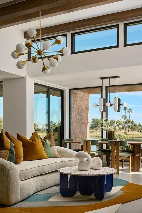
Merlot, inky blues, and burnished amber are re-entering luxury living rooms in 2026 not as primary color statements but as single, deliberate moments set against an otherwise restrained neutral field. The operating principle is concentration, not dispersal. A single upholstered sofa in deep inky blue reads as an intentional design decision; that same color scattered across throw pillows, a side chair, and a decorative object reads as indecision. The distinction matters because in a high-end residential context, restraint is not absence of color; it is the disciplined assignment of color to one primary element where it can carry full visual authority.
The vehicle through which accent color is introduced carries as much design weight as the color selection itself. Deep-toned drapery, run floor to ceiling in a burnished amber or merlot-adjacent textile, operates at an architectural scale, affecting the perception of ceiling height and wall plane in ways that a painted accent wall cannot replicate. Upholstery on a statement lounge chair introduces color at a human scale, creating an anchor point within the seating arrangement without competing with the room’s structural surfaces. These are not interchangeable approaches; the choice of vehicle determines how the color is read spatially.
Against a warm neutral backdrop anchored by Cloud Dancer walls, white oak flooring, and natural stone, a single saturated moment achieves significant visual impact at relatively low chroma levels. High-saturation applications within this material context tend to read as forced, competing with the warmth of the surrounding materials rather than deepening it. For a detailed look at how designers are navigating 2026’s returning color palette, the conversation around unexpected color choices is worth reviewing alongside your own material selections.
Color specification at this level requires physical sampling in the actual space. Digital references are unreliable; a slight undertone shift in the stone surround or the plaster finish can alter how an accent fabric reads entirely. Sampling must occur under the project’s specific lighting conditions, against the actual stone slab and floor finish, before any upholstery or drapery order is confirmed.
Lighting is a building system. In a custom home, it must be treated with the same coordination discipline as mechanical, plumbing, or structural framing. When a lighting plan is deferred until the fixture-selection phase, and the ceiling geometry, millwork profiles, and electrical rough-in have already been resolved without it, the result is a scheme that compromises on every front. Cove blocking that was never framed cannot be added after drywall. A recessed fixture centered in the wrong coffer bay cannot be relocated without reopening the ceiling. These are not corrections; they are rebuilds.
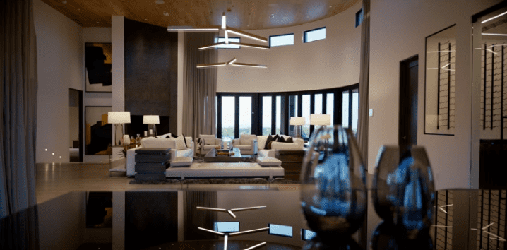
A resolved living room lighting scheme layers a minimum of four source types, each assigned to an independent dimming circuit. Ambient sources, typically architectural recessed or cove-based ceiling light, establish the room’s base illumination. Task sources address reading zones and work surfaces. Architectural accent sources, including wall wash fixtures, cove details, and millwork-integrated lighting, reinforce the spatial geometry and material surfaces that define the room’s character. Decorative sources, pendants, sconces, and table lamps, contribute visual scale and warmth. The independence of each circuit is not a luxury feature; it is the functional requirement for scene control. Without it, the room has one lighting state.
Color temperature is a specification decision made at the drawing stage, not a procurement choice made when fixtures ship. Warm white sources in the 2700K to 3000K range are standard for luxury residential environments. When decorative fixtures are sourced through separate vendors without explicit temperature specifications, mismatched color rendering is nearly inevitable, and it cannot be corrected without replacing the hardware.
At JSF Design, lighting layouts are developed alongside the millwork, ceiling, and finish documentation as a single coordinated set of drawings. This approach ensures that framing accommodations, low-voltage rough-in positioning, and dimming circuit assignments are resolved before construction begins, which is the only reliable way to ensure the finished room performs as designed.
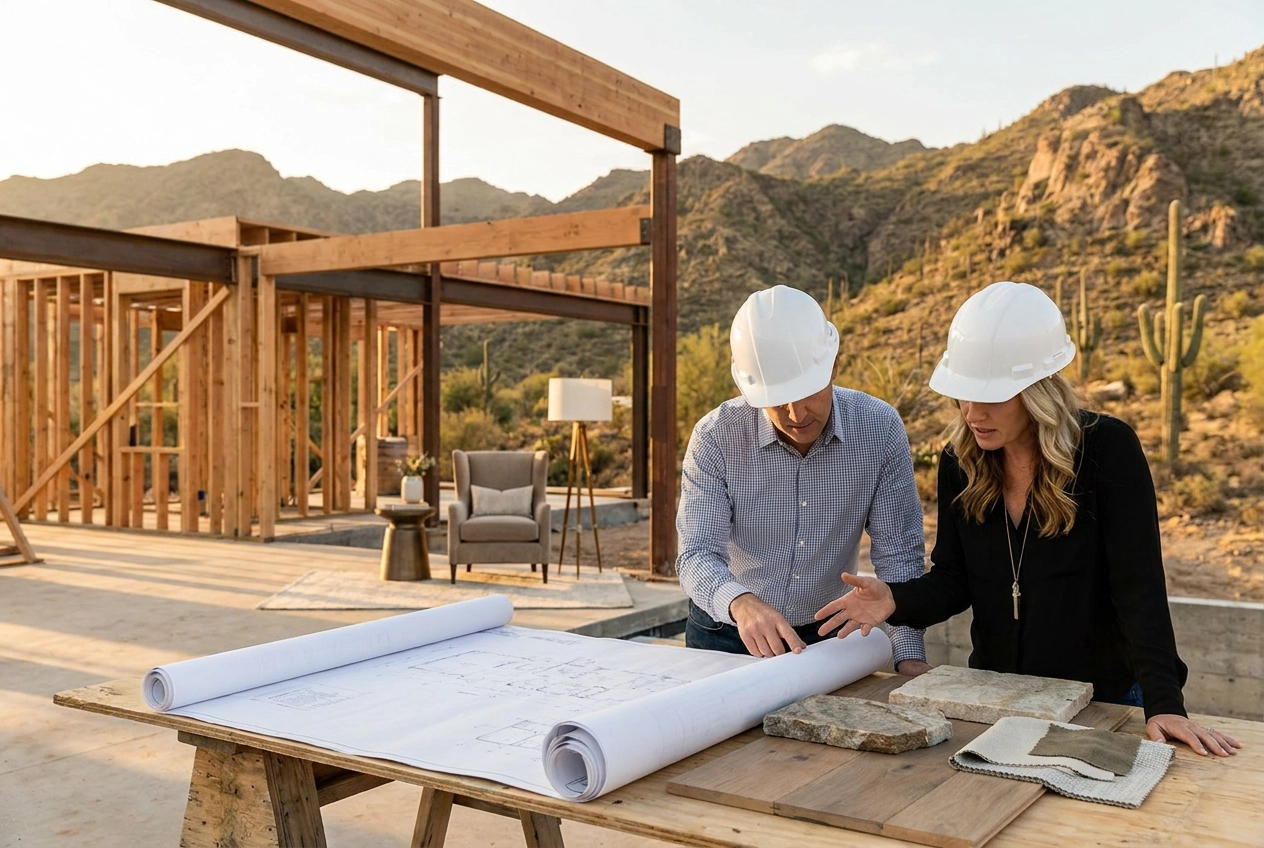
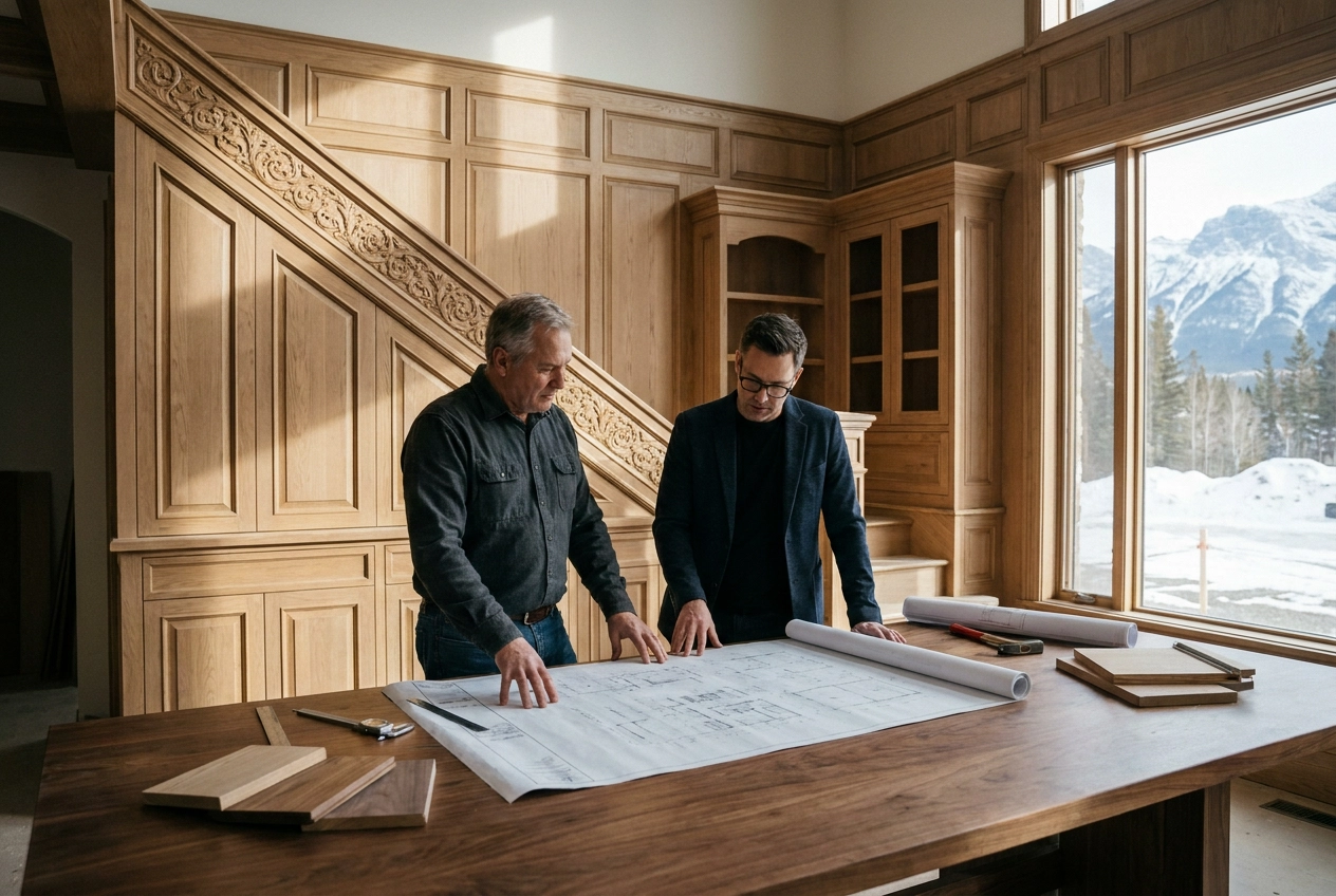
A concept presentation, however refined, is a communication tool. It is not a building instruction. When a living room design exists only as a mood board or a rendered image, it becomes vulnerable the moment construction begins. Each trade, working from incomplete or absent documentation, defaults to its own standard practice. The stone fabricator cuts slabs without a confirmed layout. The millworker builds profiles to a familiar scale, not the designer’s dimensioned intent. The electrician roughs in fixtures based on a general lighting plan rather than a coordinated reflected ceiling drawing. Individually, each decision may seem reasonable. Collectively, they produce a space that bears little resemblance to what was designed.
A rigorous specification package resolves this risk before it reaches the field. For a living room, that package includes material call-outs by manufacturer, product, and finish code; millwork elevations with fully dimensioned profiles and joinery details; furniture specifications with fabric and finish assignments; and lighting schedules cross-referenced to the electrical plan. Each document serves a specific recipient and a specific purpose, and the absence of any one element creates a gap that someone on site will fill independently.
In Scottsdale and Paradise Valley custom builds, the project team often spans an architect, structural engineer, lighting consultant, landscape architect, and multiple specialty subcontractors. Without coordinated, cross-referenced drawings, a ceiling condition framed by the structural team can conflict directly with a lighting layout that was never communicated past the design presentation. These conflicts surface as change orders, and in luxury residential construction, change orders carry real budget and schedule weight. The cost of under-documented design is not abstract; it is measured in reordered stone, rebuilt millwork, and delayed occupancy.
A full luxury living room design in Scottsdale, encompassing design fees, material specification, custom millwork, furniture procurement, and installation management, typically ranges from $35,000 to $120,000 or more depending on scope, square footage, and material tier. That range is wide because the projects within it are fundamentally different in what is being built and specified, not merely in how much is being spent.
The lower end of that range describes a living room with curated furnishings, a considered finish palette, and modest architectural detailing. The upper end, and beyond, reflects a great room with a custom stone fireplace surround, a full millwork feature wall, specified window treatments, performance upholstery, designer lighting, and bespoke case goods procured and coordinated through a full-service firm. These are not the same project.
Material selection is the most direct cost driver at the luxury tier. Natural stone, custom millwork profiles, and specification-grade upholstery fabrics each carry meaningful unit costs that compound significantly across a fully resolved room. A fireplace surround in honed marble is a different line item than one in a standard tile format, and the difference is visible in the finished space.
Furniture procurement through a full-service design firm encompasses considerably more than product sourcing. It includes detailed specification, trade coordination for delivery sequencing, and supervised installation, a scope of work that is priced accordingly and differs substantially from retail purchasing.
For homeowners in Paradise Valley, Desert Mountain, or comparable Scottsdale communities, the living room investment should be calibrated against the home’s broader material program. A living room that is under-designed relative to the surrounding architecture creates a value inconsistency that is apparent to buyers, appraisers, and anyone who lives in the space. Cohesion across a home’s material tier is not a stylistic concern; it is a resale and livability consideration.
The living rooms that remain resolved over time share one defining characteristic: every decision, from ceiling articulation to metal finish selection to accent color placement, was made deliberately and documented clearly before construction began. Specificity is the differentiator between a room that merely looks designed and one that performs as designed. Materials chosen to respond to Arizona’s particular quality of natural light, millwork scaled to the actual volume of the space, furnishings specified for the room rather than selected from a catalog — these are the decisions that separate a room with lasting integrity from one that requires reinvention within a decade.
If you are in the early stages of planning a custom home or full-home remodel in Scottsdale, Paradise Valley, Desert Mountain, or the greater Phoenix area, JSF Design works closely with homeowners, architects, and builders to develop living spaces that are resolved at every level, from the first space plan through final installation. The firm’s structured, documentation-driven process ensures that design intent survives the complexity of construction and translates precisely into the finished room. Contact JSF Design to discuss your project.
Designing a living room that truly belongs in Scottsdale or Paradise Valley comes down to a handful of non-negotiable principles. Respect the light, because it will define every material and color decision you make. Embrace indoor-outdoor connectivity as a design priority, not an afterthought. Choose furnishings and finishes that honor the Sonoran Desert’s warmth without mimicking it literally. And always let the architecture lead.
The homes in this region carry a design legacy worth honoring, and your living room is the place to make that statement most powerfully.
If you are ready to move beyond inspiration and into execution, start with one focused change: your furniture arrangement relative to your best view. That single decision will clarify everything else. The desert is already doing its part. Now it is your turn to meet it.
BEST THE EDIT
of
Material Moves: Inside Jeffrey Florentine’s Collaboration With Antolini Stone Some collaborations happen because of timing. Others happen because of shared philosophy. The partnership between Jeffrey Florentine of JSF Design and Antolini Stone feels very much like the latter — a collaboration rooted in a mutual belief that materials should shape architecture, not simply finish it. […]
Elevate Your Space
Design Goes Beyond Aesthetics...
It Shapes Experience.
+ Show / Hide Comments
Share to: