



Most designers treat a mood board as a presentation tool, something to show clients and get approvals. That assumption is where projects start to quietly unravel. A professional interior design mood board is not a portfolio piece or a client-facing sales device. It is a decision-making framework, and understanding that distinction separates designers who struggle with scope creep and costly revisions from those who execute with precision.
In this tutorial, we are going beyond the basics. You already know how to pull images and arrange them on a canvas. What we are examining here is the underlying architecture of a mood board that actually functions, how it governs material selections, controls tonal relationships, resolves spatial tension before a single piece of furniture is specified, and keeps every stakeholder aligned without constant back-and-forth communication.
By the end, you will understand how to build a mood board that works as a living reference document throughout a project lifecycle. You will also learn the specific elements that most designers omit, and why those omissions create the exact problems they were hoping to avoid.
What a Professional Interior Design Mood Board Actually Is
A professional interior design mood board is a resolved, documentation-grade visual deliverable produced at the concept phase of a project. It is not a collection of saved images or a loosely assembled inspiration board; it is a curated communication tool that establishes material direction, spatial atmosphere, finish palette, and design intent for a specific project scope. Every element included has been deliberately selected and editorially resolved. The mood board represents a designer’s point of view, not a menu of possibilities.
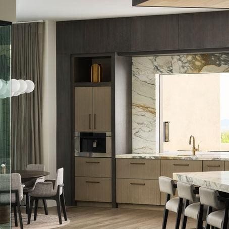
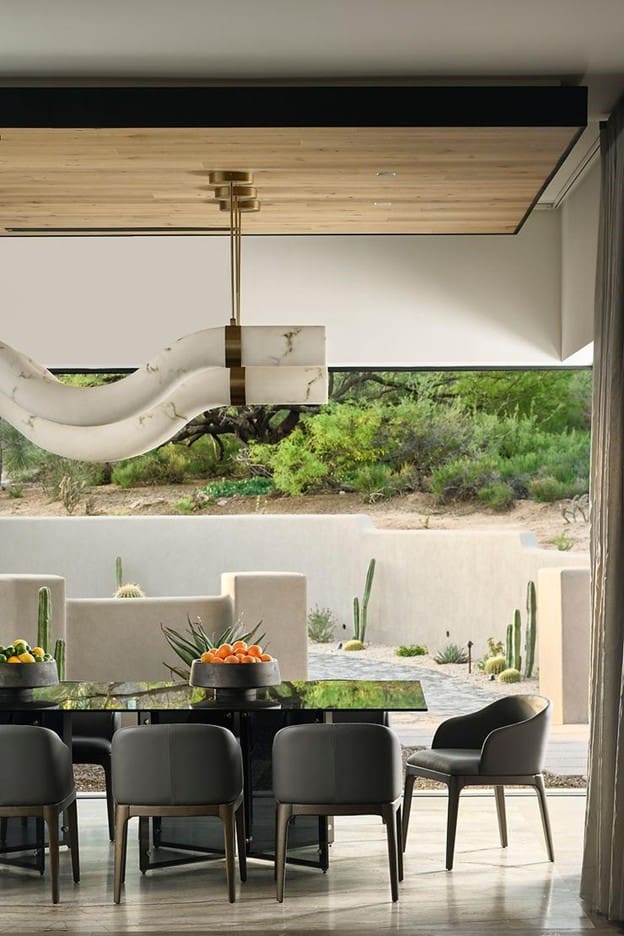
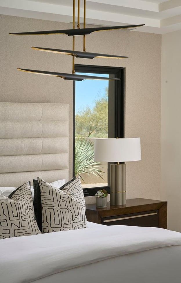
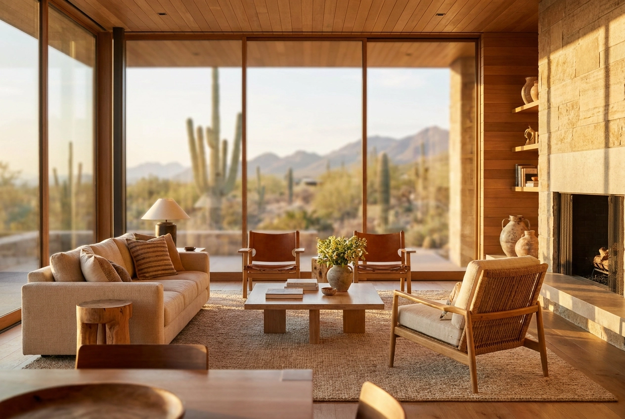
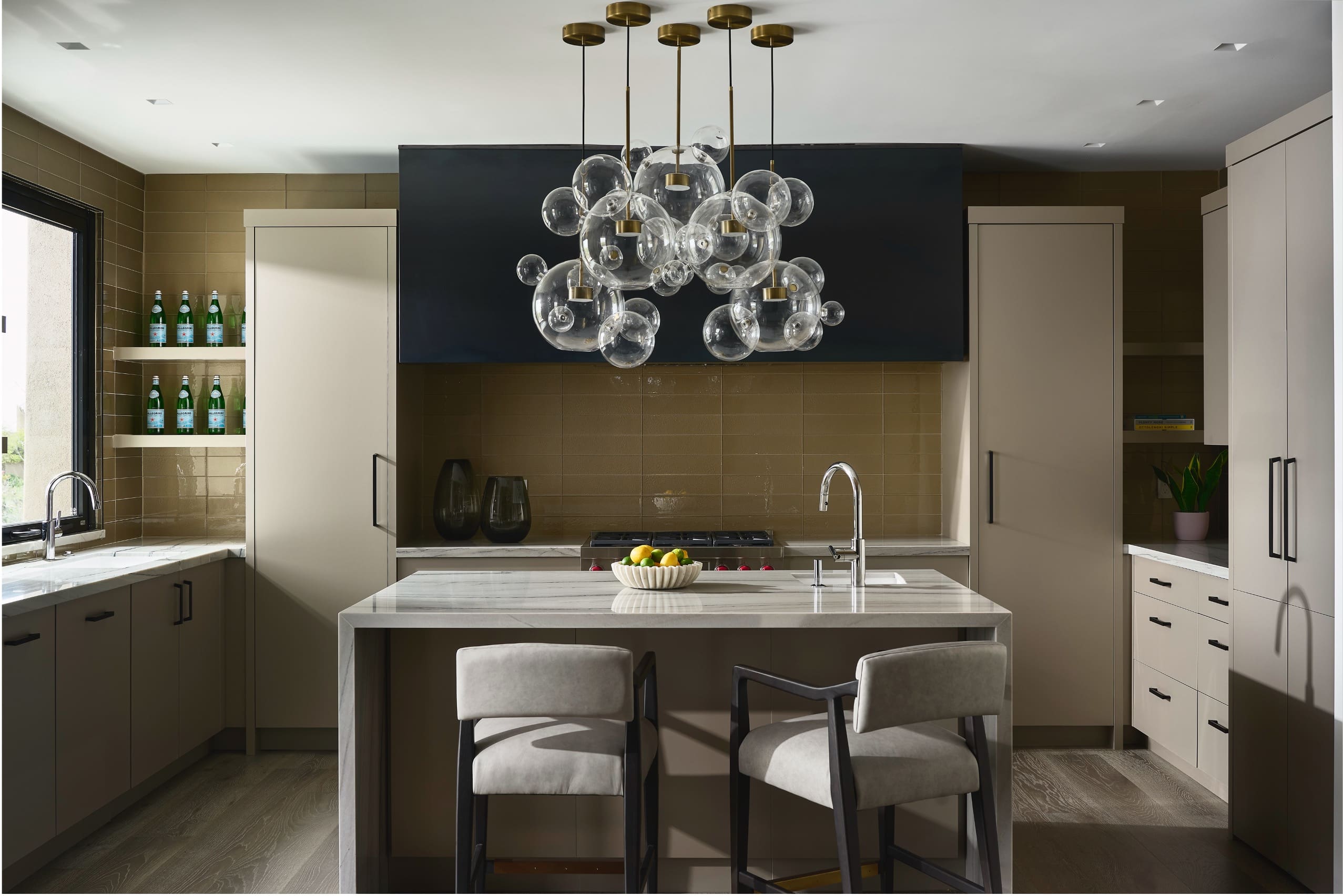
At the professional level, a mood board typically contains several distinct components working in concert. Material references, whether photographic or physical samples, anchor the palette in real, specifiable products. Color and finish direction communicates the relationship between surfaces: the warmth of a natural stone slab against the matte depth of a plaster wall, or the contrast between wire-brushed oak and an unlacquered brass fixture. Furniture silhouettes establish scale and spatial intent. Lighting references indicate the quality and warmth of illumination being targeted. For projects in the Desert Southwest, regional indicators such as warm-toned limestone, integral color plaster, and natural wood with pronounced grain are often incorporated to reflect the site’s climate, light quality, and architectural context.
The distinction between a professional mood board and a consumer tool like a Pinterest board or a collection of Houzz saves is consequential. Platforms like Pinterest and Houzz function as research aggregators; they allow users to collect images, but they do not filter for constructability, material availability, budget alignment, or spatial compatibility. A professional mood board is the opposite: it reflects everything that has been removed as much as what remains. As Interior Design Magazine has consistently demonstrated through its coverage of resolved, high-caliber projects, the difference between inspiration and design lies in the rigor of the edit.
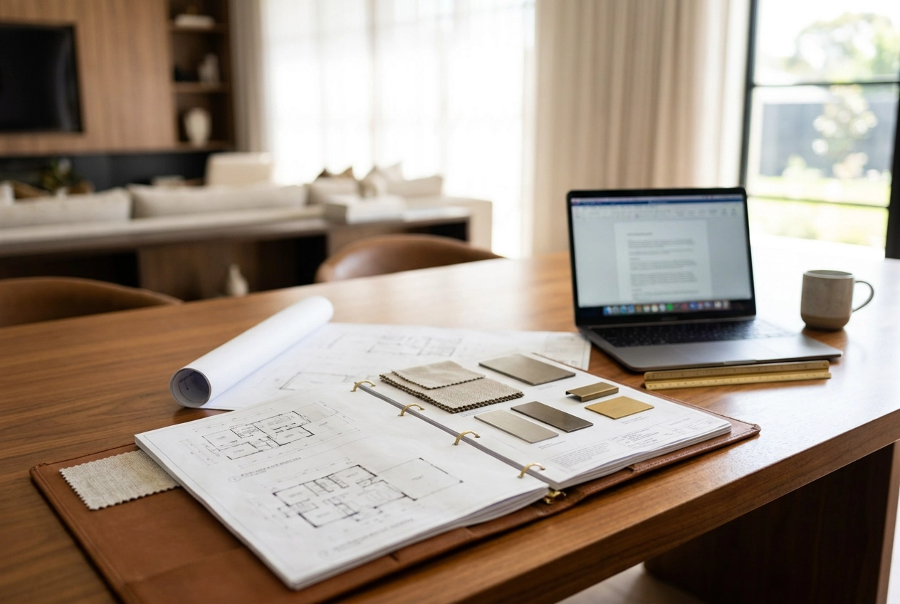
In professional practice, mood boards take two primary forms. Digital boards, produced in platforms such as Studio Designer or The Design Files and delivered as formatted PDF presentations, allow for precise visual composition and remote client review. Physical sample boards, with mounted material swatches reviewed in context, remain essential for on-site decisions where light conditions and material adjacency must be assessed directly. High-end residential firms routinely use both formats in tandem, with the digital board serving early alignment and the physical board driving construction-phase confirmation.
Critically, the mood board functions as a communication instrument before it functions as an aesthetic document. Its primary purpose is alignment: between designer and client, between concept and specification, and between visual intent and built outcome. When this alignment is achieved early, it reduces the likelihood of costly mid-project revisions on large-scale custom builds, where a single finish change can carry significant schedule and budget implications.
Where the Mood Board Sits Within a Structured Design Process
Within a formal design process, the mood board occupies a precise position: it belongs to the concept phase, which follows initial client discovery and precedes every downstream documentation deliverable. Discovery gives the design team the raw material it needs, including lifestyle priorities, spatial requirements, architectural constraints, and budget parameters. The mood board is how those inputs get translated into a shared visual language. Nothing moves forward until that language is established and approved.
The downstream implications of this sequence are significant. Once an interior design mood board is approved, it becomes the upstream source document for the entire project. Finish specification sheets, material schedules, custom millwork drawings, lighting plans, and eventually the full specification book are all developed in reference to it. A documentation-driven firm does not treat the mood board as a preliminary sketch to be filed away; it functions as a standing design reference that any team member, trade contractor, or collaborator can consult when a decision point arises later in the project. When a millwork profile is being detailed or a tile layout is under review, the approved concept board is the standard against which those choices are measured. This is how coherence is maintained across a project that may span eighteen months or more.
Skipping or compressing the concept phase is one of the most reliable predictors of costly mid-project corrections on large custom homes. A single material substitution can trigger a cascade: a stone change affects the grout specification, which affects the trim profile, which affects the adjacent cabinetry finish. When there is no approved visual reference to arbitrate those decisions, the project becomes reactive rather than resolved. In markets like Paradise Valley and Desert Mountain, where custom builds regularly involve complex material palettes and extended fabrication lead times, that kind of drift carries real financial and schedule consequences. A structured interior design process prevents this by establishing alignment before any purchasing or construction begins.
It is also worth clarifying what the approved mood board does not represent. It is not a binding commitment to specific products. It is directional. Once the intent is locked, the design team has the latitude to specify materials that satisfy the board’s tonal, textural, and compositional criteria, even as product availability shifts, substitutions arise, or the budget is refined. That flexibility is built into the process deliberately, and it is one reason the concept phase deserves the time and rigor it requires.
How the Mood Board Communicates Across the Entire Project Team
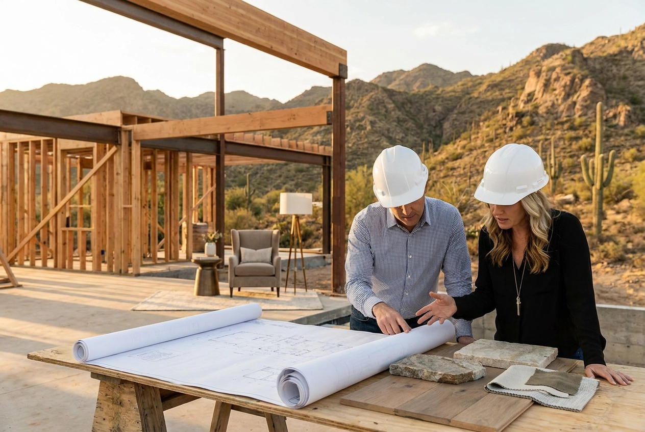
A resolved mood board does not serve the client alone. Once concept approval is secured, that same document becomes a shared reference point for every discipline involved in delivering the project: the architect of record, the general contractor, specialty subcontractors, and the procurement team managing material orders and lead times. When design intent is communicated visually and consistently across all parties from the start, the entire project operates from the same frame of reference rather than each trade interpreting verbal descriptions through their own lens.
Architects working on high-end custom homes use mood board direction to make consequential early decisions about fenestration, ceiling articulation, and material transition points. A mood board that clearly communicates a preference for warm, diffused natural light, horizontal limestone planes, and continuous indoor-outdoor material flow gives the architect concrete direction when sizing openings, specifying ceiling profiles, or resolving the junction between interior and exterior finish materials. When that intent is established at the concept phase, it prevents the kind of architectural revisions that surface mid-construction and carry significant cost implications in both time and budget.
General contractors and project managers use the mood board to anticipate sequencing demands before a single trade is mobilized. If the document communicates custom hand-applied plaster, large-format imported stone, and site-built millwork, a skilled GC can identify which materials carry extended lead times, which trades require early scheduling commitments, and where coordination between finishes will require careful sequencing. That level of pre-construction awareness directly reduces the schedule compression and substitution decisions that compromise design quality on complex residential projects.
Across specialty trades, the shared visual document reduces the risk of subjective interpretation. When a plaster subcontractor, a tile setter, and a millwork fabricator all reference the same resolved concept imagery and material direction, the probability of execution diverging from design intent decreases substantially. Each trade understands not just their individual scope, but how their work connects to the whole.
This is precisely where a structured, documentation-driven design process demonstrates its value in the field. Firms that produce clear visual deliverables at the concept phase, before specifications are written and before contracts are awarded, establish a standard of precision that carries through every subsequent document. The mood board is the first in that chain; the specification books, finish schedules, and construction drawings that follow are only as coherent as the intent that preceded them.
Regional Materiality: Designing for the Desert Southwest
In the Scottsdale, Paradise Valley, and Desert Mountain markets, a mood board that ignores regional context is not a professional document; it is a generic one. The material palette for Desert Southwest luxury interiors is shaped by the land itself: warm-toned limestone and quartzite drawn from the surrounding geology, travertine with its open, characterful grain, sand-finish plaster that reads as an extension of the desert floor, bleached or wire-brushed woods that reference the sun-weathered quality of the landscape, and warm metals such as unlacquered brass and aged bronze that patinate gracefully in a dry climate. These are not stylistic preferences. They are material decisions grounded in how this region looks, feels, and ages over time.
Arizona’s high desert light is one of the most consequential and underaddressed variables in finish selection. The Phoenix metro records approximately 299 days of sunshine annually, and the intensity of direct Sonoran Desert light is categorically different from coastal or Pacific Northwest environments. A limestone with subtle warm undertones that reads as rich and grounded in diffused northern light can appear bleached and flat under direct desert sun. Polished or lacquered finishes tend to glare; honed, matte, and hand-applied surfaces hold their depth. Every finish represented on a mood board for this geography should be selected with that specific light quality in mind, not calibrated to a neutral studio environment.
Indoor-outdoor continuity is not an amenity in Desert Southwest luxury homes; it is an organizing design principle. Covered living areas, pool surrounds, and hardscape transitions are extensions of the interior floor plan, and a resolved mood board addresses material continuity across those thresholds. When the same quartzite or large-format porcelain tile flows from the great room through a folding glass wall to the covered patio, that decision must be established at the concept phase, before material procurement begins.
It is equally important to resist treating “desert aesthetic” as a single, monolithic direction. Contemporary desert modern, transitional, and organic modern homes in this market each carry a distinct architectural language, and a mood board must be calibrated to that specific vocabulary. A board developed for a Wright-influenced organic modern residence in Desert Mountain, with its emphasis on horizontal planes and integrated stone, requires an entirely different material and tonal approach than one developed for a glass-and-steel contemporary on a Paradise Valley hillside.
Texture plays a structural role in desert-climate interiors that the mood board must communicate, even in a two-dimensional format. Layered neutrals built from raw linen, hand-applied plaster, and honed stone read as warm and resolved because each surface absorbs and reflects light differently. Polished finishes, by contrast, can feel discordant against the matte quality of the surrounding landscape. A professionally constructed mood board captures this tactile dimension through the careful curation of material photography, surface close-ups, and finish samples, conveying not just color but the physical quality of how a space will feel under the light that defines this region.
Client Psychology and the Value of Visual Pre-Commitment
Affluent homeowners and spec developers who review and approve a resolved mood board before material procurement begins are measurably less likely to request directional changes once construction is underway. This is not a soft observation; it reflects a well-documented dynamic in high-value project management. When a client has visually confirmed a direction, they have made a cognitive commitment to it. That commitment creates psychological ownership of the decision, which significantly reduces the impulse to reverse course once the project is in motion.
The mechanism at work is visual pre-commitment: the process of anchoring a decision to a concrete visual reference before financial exposure begins. Verbal descriptions of design intent, however precise, carry inherent ambiguity. When a designer describes a palette as “warm, mineral-toned, and grounded in natural stone,” two clients in the same room will likely form two different mental images. A resolved mood board eliminates that gap. It converts a description into a shared reference point, allowing both designer and client to evaluate whether a proposed direction is genuinely aligned before a single specification is committed to a purchase order.
On projects where selections span hundreds of line items, including flooring, wall finishes, cabinetry, hardware, lighting, upholstery, stone, and tile, this shared reference becomes operationally critical. The mood board functions as a decision filter. Rather than evaluating each new specification in isolation, the design team and client can measure every selection against a single, resolved visual standard. This keeps reviews focused, reduces deliberation fatigue, and prevents the scope creep that occurs when direction is reconsidered at every material presentation.
The financial stakes in this market are not abstract. A mid-project material change on a $3M custom home in Paradise Valley can trigger restocking fees, reorder lead times exceeding 16 weeks for custom stone or imported tile, and cascading revisions to adjacent finish specifications. A change to a primary stone selection, for example, may require revisiting grout profiles, metal finishes, cabinetry tones, and plumbing fixtures throughout an entire wing of the home. A well-executed mood board presentation, reviewed and formally approved before procurement begins, is among the most cost-effective risk mitigation tools available in the pre-construction phase.
It is also worth recognizing that clients arrive at the design table with varying degrees of visual fluency. Architects, real estate developers, and design-forward homeowners often read material relationships intuitively and engage with a mood board as a peer-level dialogue. Other clients, regardless of sophistication in their own professional domains, may need more translation support to move from abstract design language to spatial reality. The professional mood board serves both groups with equal effectiveness. For the visually fluent client, it validates and sharpens a direction they can already read. For the client who needs translation, it makes the design language legible and specific, replacing uncertainty with informed confidence before costs are locked in.
Professional Tools and What They Signal About a Firm’s Process
The platforms a firm uses to build and present mood boards are worth understanding, because tool selection reflects process discipline. High-end residential design firms working at the level of full custom homes and comprehensive remodels typically rely on Studio Designer or Design Files for digital presentation-quality boards. Both platforms are purpose-built for the interior design industry, allowing designers to integrate product specifications, vendor sourcing, and client-facing visuals within a single documented workflow. Canva Pro functions differently; it is most useful for rapid concept sketching in early discovery conversations, where speed and flexibility matter more than integration with downstream specification data.
Physical sample boards occupy a separate and irreplaceable role. A digital board can communicate proportion, palette, and material category with precision. What it cannot communicate is the actual weight of a honed limestone tile, the hand of a performance linen, or the way a brushed brass finish reads under the specific quality of light in a west-facing great room in Paradise Valley. These are material truths that only a physical sample, reviewed in context and under the home’s actual light conditions, can confirm. For this reason, committing to a final material specification based solely on a screen presentation is a process risk that experienced firms avoid.
Sophisticated practices use both formats in sequence. The digital mood board establishes and distributes design direction across the full project team, giving the architect, builder, and procurement coordinator a shared reference document. Physical samples are then reviewed on site before specifications are finalized, functioning as the confirmation layer.
The way a firm formats and presents its mood board at the concept phase is itself a signal worth reading. A resolved, well-structured board indicates that the same rigor will carry through the firm’s specification books, construction drawings, and coordination during the build. Presentation quality at the concept stage is rarely an isolated quality; it reflects how a firm manages information across the entire project lifecycle.
The Mood Board as a Foundation for Resolved Design
The interior design mood board serves two functions that are equally consequential: it aligns the client to a resolved design direction before a single specification is written, and it gives the entire project team, architect, builder, and trades, a shared visual reference that holds the design accountable through every phase of execution. In high-end residential work, both functions are prerequisites. Neither is optional.
What the preceding sections have established is worth restating plainly: the mood board is not decorative documentation. It is the upstream visual source document from which every downstream decision inherits its logic. FF&E schedules, finish specifications, custom millwork drawings, and procurement decisions all trace back to it. When that source document is resolved with intention and detail, the project builds from a position of clarity. When it is absent or underdeveloped, ambiguity compounds across every subsequent phase.
For homeowners beginning a new build or full-home remodel in Scottsdale, Paradise Valley, or Desert Mountain, one of the most important questions to ask a prospective design firm is not about aesthetics. It is about process: what deliverables does the concept phase produce, and how do those deliverables communicate to the broader project team? The answer reveals whether a firm is equipped to manage a project of genuine complexity, or whether it is operating informally in a space that demands precision.
JSF Design’s approach to concept-phase documentation reflects the belief that structured process produces better buildings. For those interested in understanding how that process works across a full residential project, our services and process overview provides a clear picture of what each phase delivers and why it matters.
Intentional, documented design process is not overhead. It is the mechanism by which vision becomes built reality.
Conclusion
A professional mood board is not decoration for your pitch deck. It is the structural foundation that governs every decision from first concept to final installation. When built correctly, it eliminates guesswork, reduces costly revisions, and keeps every stakeholder aligned without constant follow-up conversations.
The designers who execute projects with precision are not more talented. They simply have better tools working harder behind the scenes.
Take what you have learned here and rebuild your next mood board from the inside out. Start with intention, not aesthetics. Define the tonal relationships first, let material logic follow, and treat every element as a decision, not a decoration.
Your mood board should do the work before the work begins. Build it that way, and your projects will reflect the difference immediately.


BEST THE EDIT
of

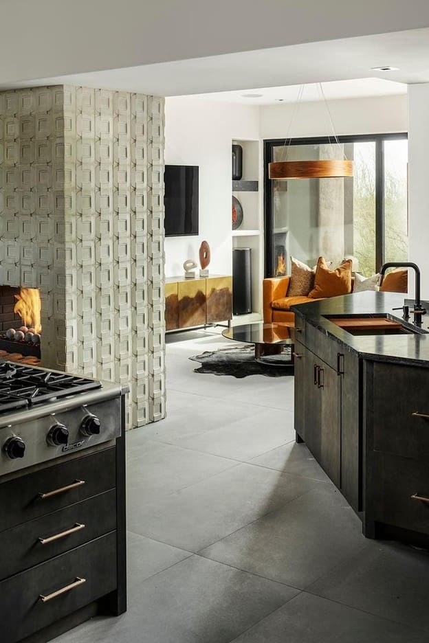
The collaboration between Jeffrey Florentine of JSF Design and Antolini began with a shared conviction: natural stone should shape architecture, not simply finish it. Featured by Modern Luxury Scottsdale, Elementa is a collection developed with Antolini to explore how texture, proportion, light and repetition can give stone a more architectural role in the home. Jeffrey […]
Elevate Your Space
Let’s Bring Your Vision to Life
Design Goes Beyond Aesthetics...
It Shapes Experience.

+ Show / Hide Comments
Share to: